
The Happy Path Delusion
Designing for Chaos

If you are just joining us, we are dismantling the reasons why modern product teams burn out. This is a journey, and today we take the next step.
We started by naming the problem: The Hamster Wheel (Episode 1). Then, we exposed the Whack-a-Mole trap (Episode 2) to show how we confuse motion with progress. Finally, we dove into The Iceberg (Episode 3) to understand why organizations reward firefighting instead of fire prevention.
Today, we are moving from the organization to the product execution. We are going to talk about why your product looks great in the demo but breaks the moment a real human touches it.
We are going to talk about The Happy Path Delusion.
Let’s play this scenario about an imaginary mobile payments company you are working for. They were preparing for the biggest launch in their history. The design team had spent six months polishing the “Send Money” flow.

It was breathtaking. The animations were 60fps liquid butter. The transitions were seamless. The “Success” screen exploded with delightful confetti, triggering a haptic vibration that felt like pure victory.
When the VP of Product demoed it on stage at the company All-Hands, using the high-speed office WiFi and a test account populated with perfect, sanitized data, the room erupted in applause. It looked like the future. It felt like magic.
You launched it to 10% of the user base on Monday. By Tuesday, the support queue wasn’t just busy; it was a crime scene.
“You stole my money! The recipient didn’t get it and my balance is zero!”
“The app freezes when I try to select a contact.”
“I got an error message that just says ‘Object Null’. What does that mean? Did I break it?”
What happened?
You had built a product for the Happy Path.
You assumed the user had a stable 5G connection. In reality, they are using a Tecno device from 2015, standing in a concrete stairwell with one bar of Edge network. You assumed the user had friends with valid bank accounts. In reality, they were sending money to a phone number (Mobile Money) that hasn’t been verified in three years. You assumed the user would wait for the animation to finish. In reality, they are anxious and in a hurry, so they rage-tapped the button four times because the UI was slow to respond.
The polished demo was a hallucination. You had designed an F1 racing car with millimeter-perfect clearance, intending it to travel the Old Lagos-Abeokuta Expressway. The moment it hit the potholes of the real world, the axles snapped, and the engine exploded.
The Myth of the “Perfect User”
If you look at most Product Requirements Documents (PRDs) or Figma files, they feature a protagonist I call The Perfect User. The Perfect User is a convenient fiction we tell ourselves to make the job easier.
The Perfect User always reads the onboarding text and understands every nuance. They grant all permissions (Location, Camera, Contacts) immediately and without suspicion. They input their name correctly (no emojis, no special characters, proper capitalization). They never hit the “Back” button in the middle of a transaction to check their balance. They have a fully charged battery, 20/20 vision, and the patience of a saint.
The Perfect User does not exist.
This belief in the Perfect User is a flawed Mental Model (Level 4 from our Iceberg framework). It assumes order in an unpredictable universe of chaos.
Real users are chaotic agents of entropy. They are drunk at 2 AM trying to unlock a scooter with greasy fingers. They are stressed parents trying to pay an electric bill with a screaming toddler in one arm and 1% battery life on their phone. They are skeptical boomers who deny every permission request out of fear of being tracked. They are distracted commuters whose thumbs slip and hit “Cancel” instead of “Confirm.”
When you design for the Perfect User, you are creating a Fragile System. A Fragile System works only under ideal conditions. It breaks under volatility.
A Resilient System assumes the user is distracted, the network is hostile, the database is on fire, and the input is malicious. It expects the user to click a WhatsApp notification popup in the middle of a transaction, switch apps, and return 20 minutes later expecting their cart to still be there.
The Three Zones of Entropy
To cure the Happy Path Delusion, you must stop designing for the “Success State”, that’s the easy part and start designing for the Variance. There are three specific zones where entropy will attack your product.
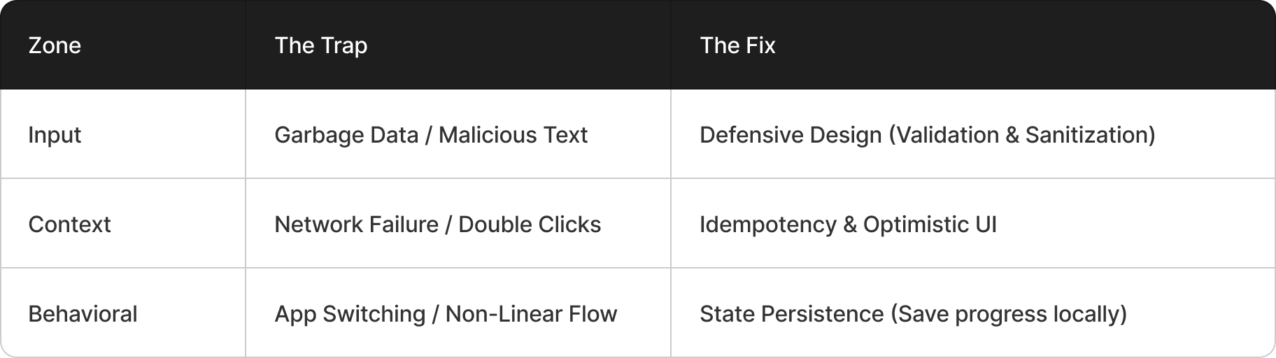
1. Input Variance
The Happy Path assumes the user enters “John Smith.” The Reality is the user enters “J@hn $mith 💀”, or pastes a string of 5,000 characters from a PDF, or uses an emoji as their last name.
The consequence is severe. If your backend isn’t sanitized, this garbage data crashes the database or creates “ghost” records that can’t be retrieved. If your UI doesn’t handle text wrapping, the layout breaks, buttons get pushed off-screen, and the app becomes unusable.
The fix is Defensive Design. You don’t just “design the input field.” You design the validation logic, the error masking, and the character limit feedback before you design the success state. You assume the input is guilty until proven innocent.
2. Context Variance
The Happy Path assumes a linear flow: User clicks “Buy.” A spinner appears for 0.5 seconds. “Success!” The Reality is the user clicks “Buy” just as their vehicle reaches the Third Mainland Bridge. The signal drops from 4G to “Lie-Fi” (connected but no data). The request times out. The user, thinking nothing happened, clicks “Buy” again. And again.
Does the system charge them three times? Does the app hang forever on a spinning wheel of death, forcing them to force-quit?
The fix is Idempotency (ensuring that clicking the button ten times results in only one charge) and Optimistic UI. Optimistic UI means the app assumes success and updates the screen immediately, but silently handles the rollback if the network fails, presenting a polite “Message failed to send, tap to retry” option instead of a crash.
3. Behavioral Variance
The Happy Path assumes a straight line: Step 1 → Step 2 → Step 3 → Finish. The Reality is a mess: Step 1 → Step 2 → User gets a WhatsApp notification → Switches apps → Android OS kills your app background process (common on Transsion devices) → User reopens app → The app restarts from Step 1.
Does the system remember the data from the first attempt? Or does it clear the form, infuriating the user and causing them to abandon the cart?
The fix is State Persistence. The system must be “stateless” enough to handle non-linear navigation without losing the user’s progress. The user should be able to wander through your flow like a garden, not a hallway.
Design Inversion
While many design the Success State first because it feels good and sells the vision. Veterans design the Failure State alongside the Success State because it saves the product.
They apply the oldest rule of survival to software: Hope for the best, prepare for the worst.
This is a principle I call Design Inversion. It is the discipline that separates the Firefighter (who reacts to the error) from the Architect (who designs for the error).
When I kick off a new feature, I forbid the designers from showing me only the “Success Confetti” screen. Honestly, I could care less about it. What I truly long to see and what I obsess over are the edge cases. Show me the “404,” the “500 Error,” the “Timeout,” and the “Empty State.”
Why? Because the Failure State is where Trust is won or lost.
When the app works, the user feels nothing. They expect it to work. It’s a hygiene factor. (Neutral Trust).
When the app breaks and gives a cryptic error (”Error 503: Bad Gateway”), the user feels stupid and angry. They blame themselves, then they blame you. (High Trust Drain).
When the app breaks but handles it gracefully (”We’re having trouble connecting to the bank. Don’t worry, your money hasn’t left your account. We saved your details. Try again in 5 seconds.”), the user feels safe. They feel looked after. (Trust Preservation).
The Monday Morning Exercise: The Chaos Monkey
Meeting: Design Review / Desk Check
Time: 20 Minutes
The next time a designer or engineer presents a flow to you, stop nodding along. Instead, play the role of the Chaos Monkey. This is sometimes called Red Teaming, they are actively trying to break the system before a user does.
Ask these questions to break the illusion:
The Tunnel Test: “What happens to this screen if the internet cuts out exactly when I tap the button?” (Does it freeze? Do I lose my data? Do I get a retry button?)
The Grandma Test: “What happens if I have my font size set to 200% for accessibility?” (Does the ‘Submit’ button disappear off the bottom of the screen? Does the text overlap?)
The Spam Test: “What happens if I paste the entire script of Bee Movie into this text box?” (Does the backend reject it gracefully, or does the app crash?)
The Fatigue Test: “What happens if I rage-click this button 10 times in one second?” (Do we fire 10 API calls, or do we debounce the button?)
The Multitask Test: “What happens if I minimize the app to answer a text, then come back 10 minutes later?” (Is my form data still there?)
The Low-End Test: “What happens if I run this on a low-memory device that forces a refresh?”
The Deliverable:
For every “It breaks” or “I don’t know” answer, create a Jira ticket. Label it “Resilience.” Do not ship the feature until the resilience tickets are closed.
Even better? Do User Testing. Get a click-through prototype in the hands of a real user (not a colleague) and watch them fail. It is the fastest way to mitigate your assumptions and learn the chaos of the real world.
The Golden Rule:
A product is only as strong as its error states. If you design for the 1% perfect journey, you are building a product that is broken 99% of the time for the 99% of users who live in the messy, chaotic real world.
The Recap
The Happy Path is a Myth: Real users are chaotic. Design for them.
The 3 Zones of Entropy: Prepare for bad data (Input), bad networks (Context), and bad focus (Behavior).
Design Inversion: Design the failure states (404s, Timeouts, Empty States) with as much love as the success states.
Be the Chaos Monkey: Break your own product before the market does.